Signal 1
The problem seemed deeper than navigation
People wanted one reliable place to see what they owned and know where to act.
Turning a fragmented financial experience into one shared direction for customers and more than 20 partners.
People with more than one account could not see everything together. Each part of the site worked differently, so customers had to jump between separate experiences to understand what they owned and what they could do next.
I worked with a small design team and more than 20 partners across the organization. My role was to help the group understand what was really going wrong, turn competing needs into a shared direction, and choose a useful first step that the larger system could support.
Why it was messy
Customers were trying to create one financial picture from products, account types, data, and actions that had been designed in separate parts of the company. A navigation fix alone would not address the inconsistent information and mental models underneath it.
Signal
Research suggested that customers experienced the company as several separate companies instead of one. Behavioral data showed them moving between different parts of the site just to finish simple tasks, while feedback and support tickets helped confirm that the problem was common.
Signal 1
People wanted one reliable place to see what they owned and know where to act.
Signal 2
They naturally grouped accounts around goals like retirement, investing, and banking.
Signal 3
When people linked outside accounts, they expected to see them next to the accounts held with the company.
These videos show the fragmented starting point and the proposed shared account panel.
Before
People had to move between different areas to understand balances, performance, and available actions. The site reflected the company's internal structure instead of the way people thought about their finances.
After
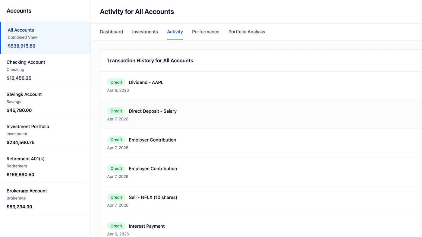
The proposed panel put internal and outside accounts in one consistent view. It gave people a clear place to start before choosing what to do next.
From signal to direction
The work was less about finding one perfect answer and more about helping a large group understand the same problem, make deliberate tradeoffs, and move toward a first release the system could actually support.
01: Signal
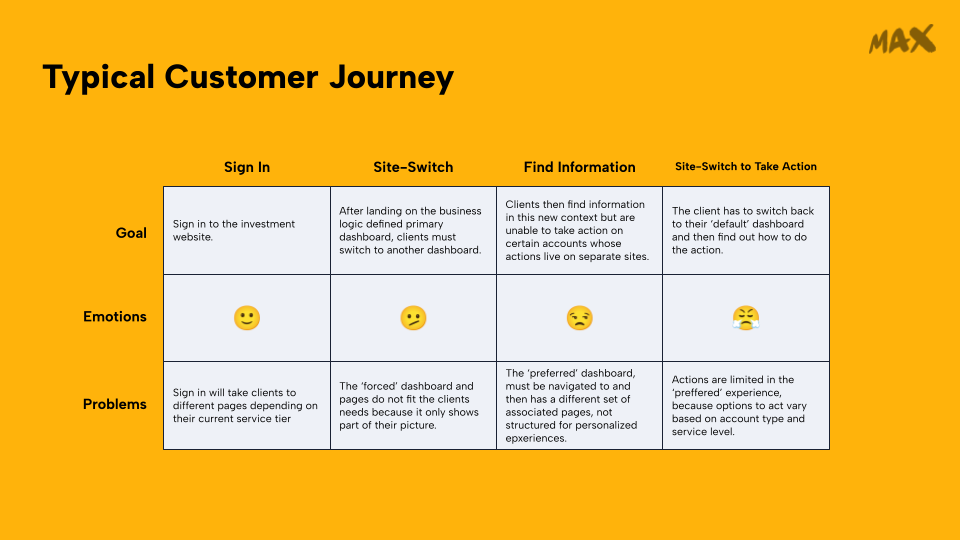
People usually came in with a simple goal: check a balance, review performance, or make a transaction. But they often had to jump between several areas to find the right account and complete the task.
Numbers did not always match, labels changed, and the site's structure made people learn how the company was organized. Mapping that journey helped make the fragmentation visible to the team.
02: Decision
We could not fix every system at once, so we focused on a shared panel that showed all accounts together. It created one reliable starting point without requiring the organization to rebuild every downstream experience first.
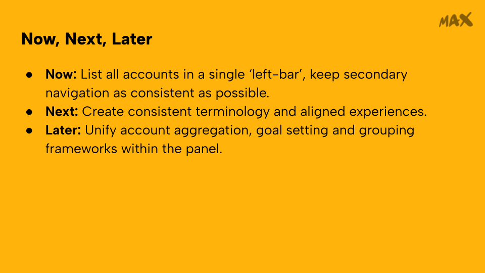
03: Tradeoff
I advocated for including outside accounts so people could see their full financial picture. At the same time, some capabilities had to wait because the underlying account data was not yet consistent enough.
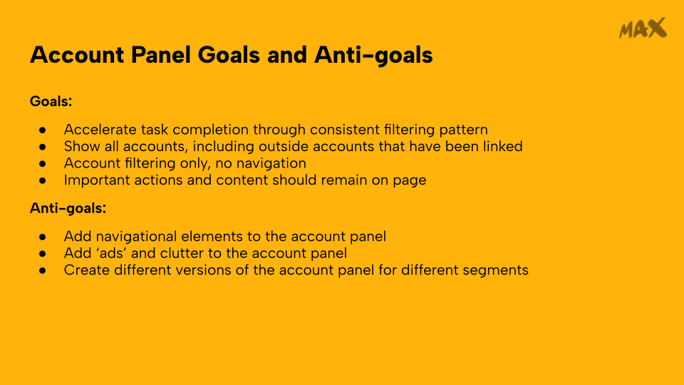
I also worked with others to set goals and anti-goals so the shared space would help people understand and act instead of slowly becoming another place for ads and unrelated messages.
04: Direction
Testing suggested a clear theme: people felt like they could finally see everything in one place.
I helped more than 20 team members align around the first release and the longer-term direction. The result depended on the work and judgment of many people across the organization, but my responsibility was to help make the problem, tradeoffs, and path forward understandable enough for the group to move together.
Evidence
The available results suggested improvement across navigation satisfaction, support demand, and cross-service task completion. I am keeping these claims directional because the exact effect sizes are not included here.
The experiment pointed toward better satisfaction with finding the right place.
It also pointed toward fewer calls tied to trouble finding information.
More people completed tasks that crossed different services.